Bruuuuuhhhhh
- Zyprr

- Feb 13, 2020
- 2 min read
This is it mates, my last submission point for my senior piece. I'm so tired with this piece, don't get me wrong, I'm still interested in the concept and I'm happy with the overall design of my piece and everything, I'm just soooo TIRED of working on it. So without further ado, here it is.

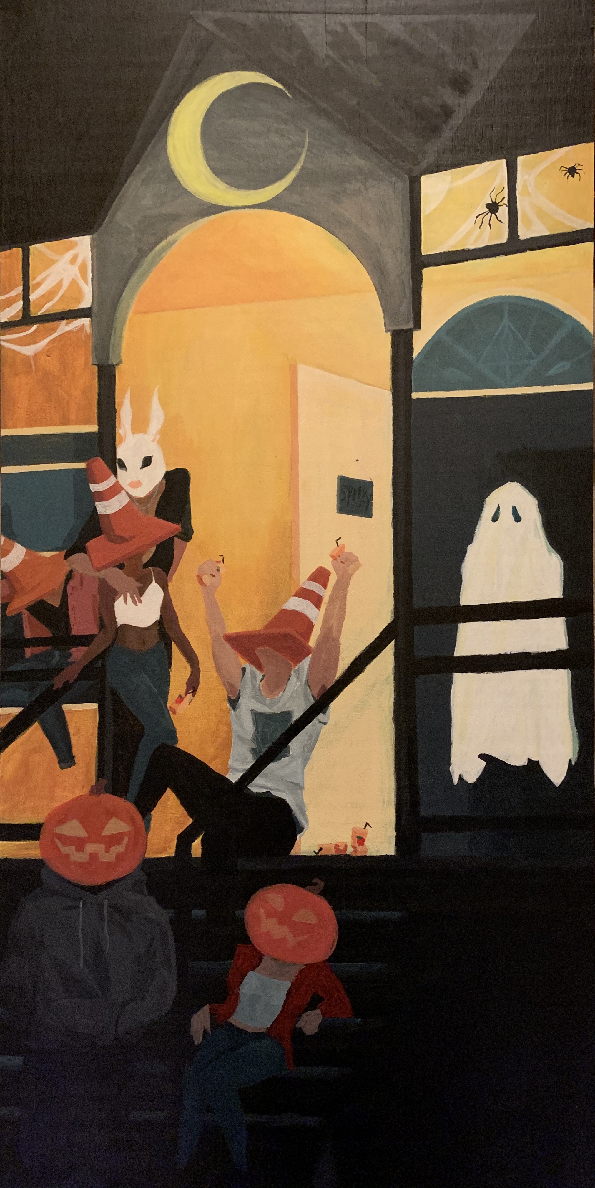
My piece is "done" I have worked on it for a very long time and I have submitted it for its final grade. Though I have done all that, I will most likely come back to it and work on it even further to prepare it for our senior show. To do this I would add further details to enhance the quality of the art, such as better shading and lighting. I do really like what I have done but as always it can be improved upon and I want to be able to present something I am truly proud of at our show.
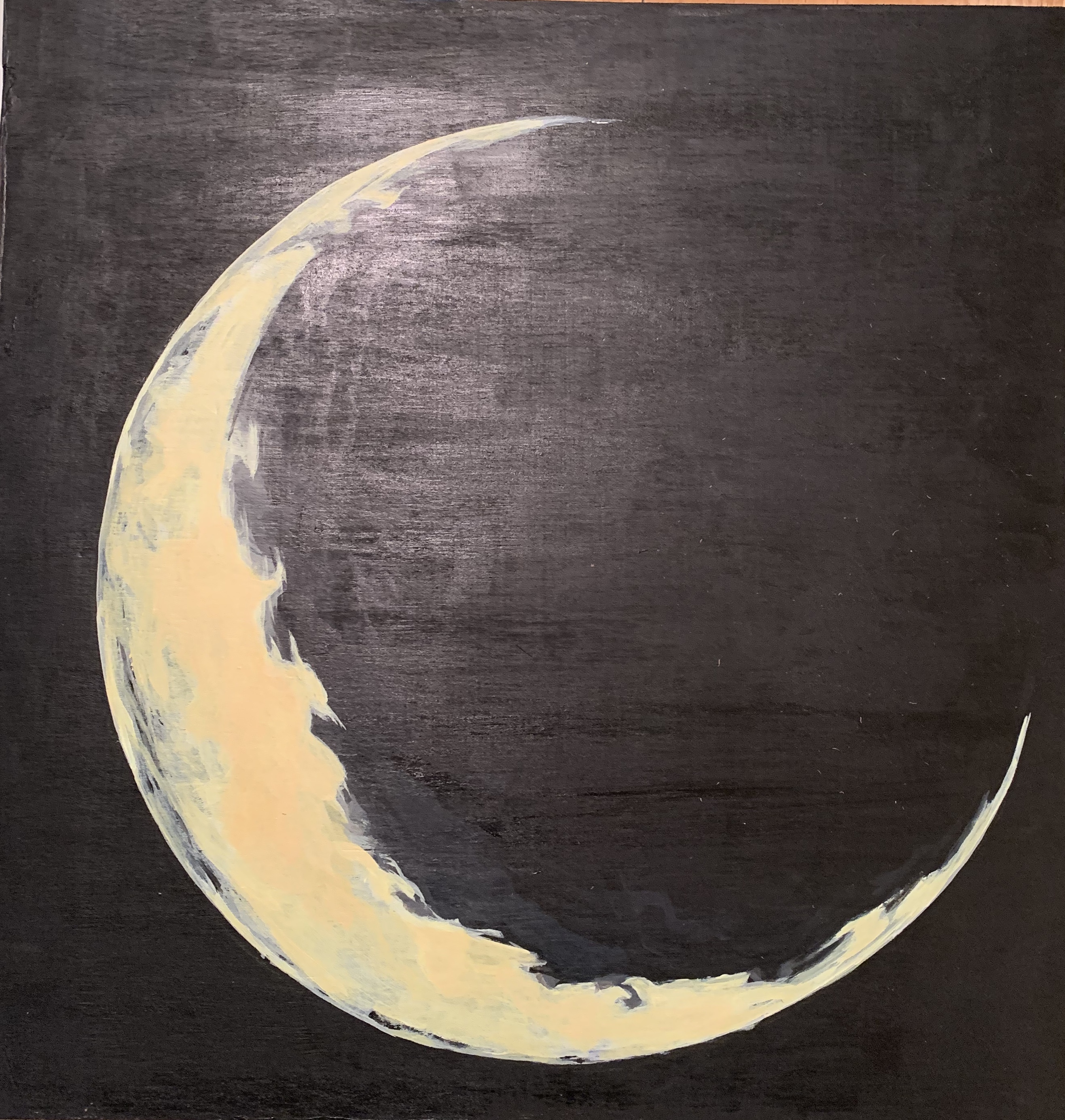
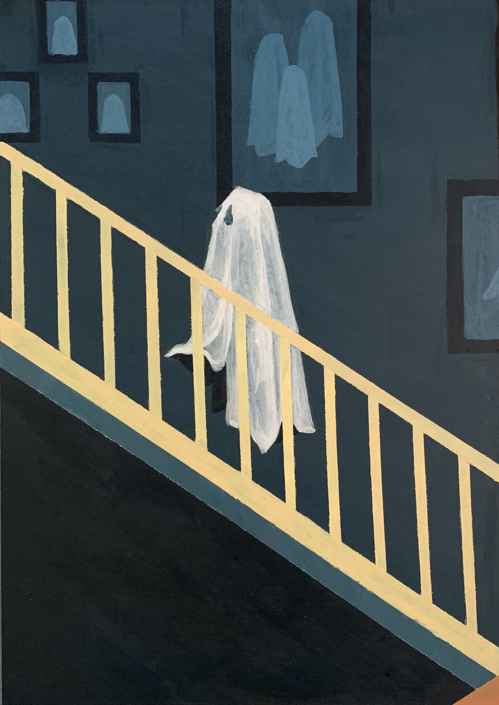
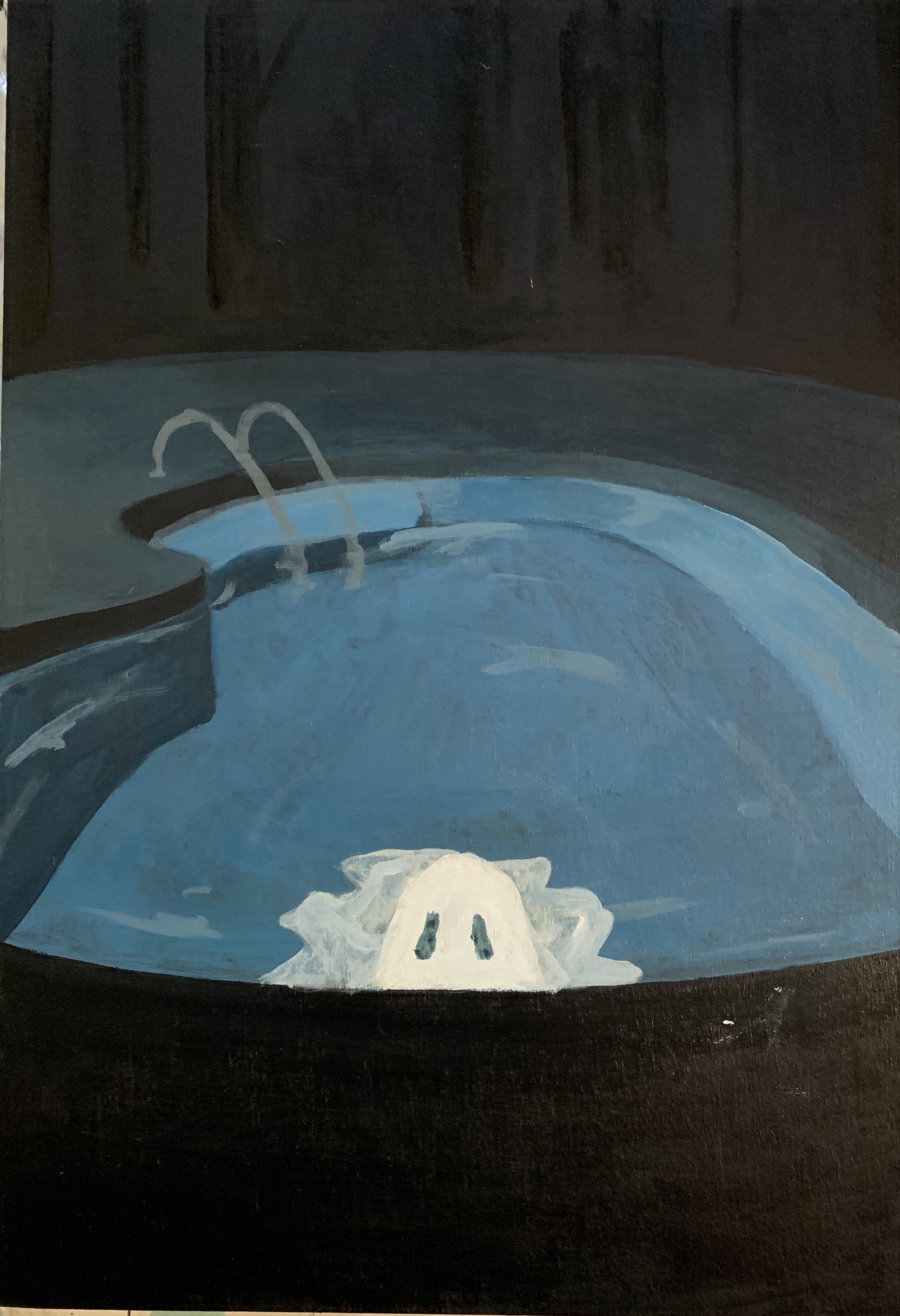
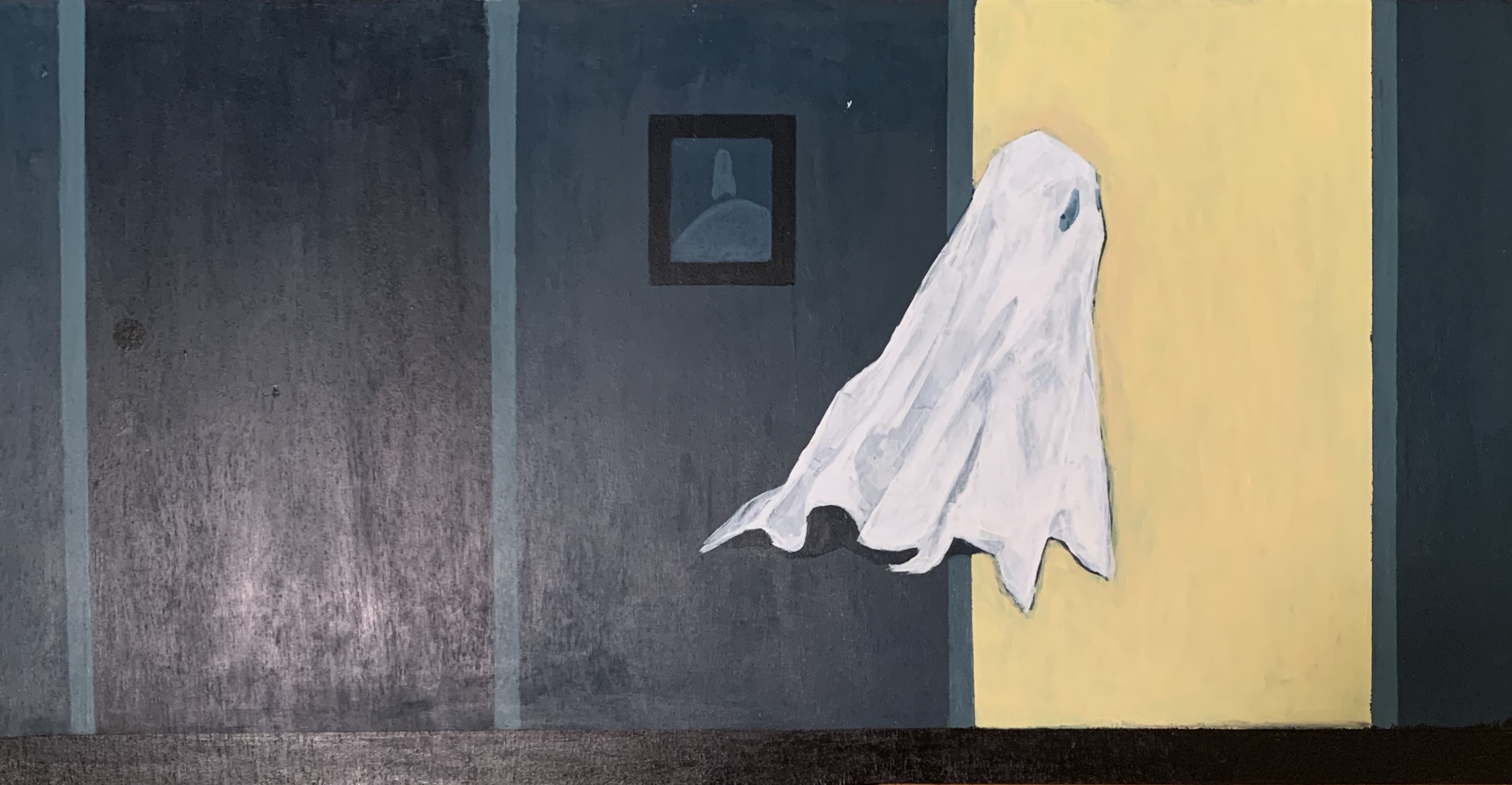
When creating this piece I definitely went through some design changes such as the extra panels that are meant to surround the main attraction. At first it was supposed to be the singular panel mounted on the wall but I wanted to add more to the composition and came up with these extra scenes. The scenes helped to add more depth to the concept and emphasize the character of the ghost. It shows his seclusion from the others along with giving the viewer some context for a story. The images are meant to suggest that the ghost is the one who lives in the house and all these other kids came to party and he ultimately feels like an outlier.
One of the artists that I have been interested in for a long time, Ana Godis, has a particular style of paranormal themes. Similar in a way to how I have made my piece. Her colors seem to hold a thickness to them that I have been trying to mimic in my piece.


Another artist I have been interested in lately is Valentina Remenar. Their art often uses bold colors heavy in saturation with unique designs and patterns. There is lots of overlapping in shapes and then a manipulation of the colors and composition.


Some things that I was really excited about was how some of the colors came out. Typically, I have a harder time using them appropriately but this time I managed to do something right. I did have a hard time getting some of the skin tones right and shading them for that matter. This is one of the things that I am going to go back and fix since I was not totally happy with the results. On the flip side, I feel like I have accomplished a lot in this piece, both conceptually and visually. I was really happy to find a concept and theme that I could continuously build off of throughout my planning and even during the actual art making process. As I continue to improve upon my piece I would like some advice on what I should change. Is there any spaces that don't look like they're completed? Are there any elements that I could add to make it better?


I really really like your piece and I think it has turned out very well even after you added more to it for the senior show. I think you made a good choice adding the smaller panels around it, they helped add to it and I think it looks really good hung up! I think one of my favorite details of your piece is the crushed juice boxes. You are really good with acrylics and your ability to get very well done smooth blends shows. I think you made a good choice choosing a medium you were comfortable with and it paid off!
Oi bruv, this is pretty good bruv. I seriously love the rendering style you chose for your pieces and that you've decided to let some things stay flat and for gradients to be subtle in order for the overall composition to be easy to process and look at, especially since you have multiple paintings surrounding the bigger one and there'll be a flat color between the paintings as well. I think you've really captured the feeling of alienation from the bad crowd by having lil' ghosty alone or separated from them. It sort of creates that conflict of missing out vs. ruining your life, creating that somber and lonely tone (unless that isn't the point and I'm stupid, just yell…